
Website Design for Carpenters: Layouts That Win Work
Carpentry sells visually. Here's the layout that puts your workmanship in front of people first.
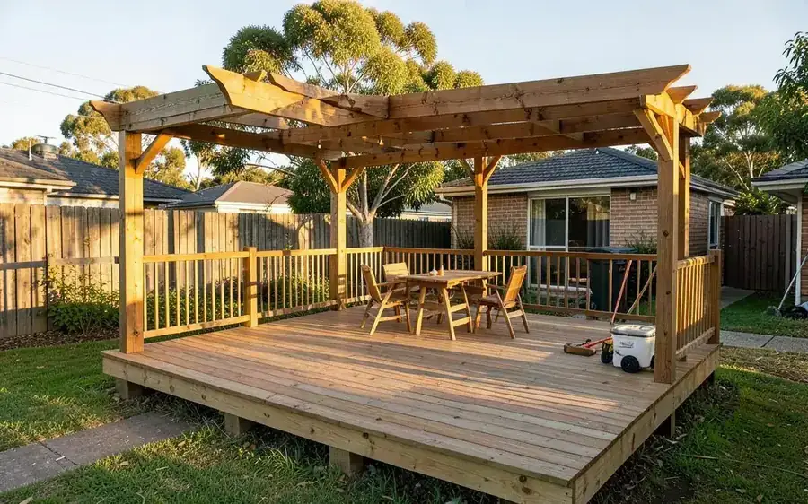
Carpentry is the most visual trade there is. Customers judge you on joins, finishes and proportions long before they read a word — so the layout of a carpenter's website matters more than it does for most trades.
The layout, top to bottom
- Hero. One strong wide photo of finished work, your trade and area in plain words, phone number and a quote button.
- What you build. A row of cards, one per service, each linking to its own page. Use a real photo on every card, not an icon.
- Recent work. Six to nine photos, ideally with before-and-after pairs.
- Why you. Licence, insurance, years on the tools, how you quote.
- Reviews. Three or four with names and suburbs.
- Areas covered. Links to your town and suburb pages.
- Contact. Short form, phone, hours.
Pages worth having
- Decks and outdoor living
- Pergolas and patios
- Home renovations and extensions
- Built-in storage and joinery
- Doors, windows and trim
- Repairs and small jobs
- Commercial or shop fit-outs, if you do them
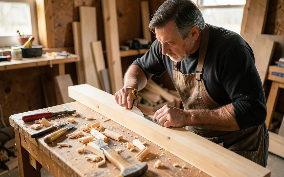
Design choices that actually help
- Big images, few words. Wide photos with short captions beat paragraphs of description.
- Consistent photo shapes. Mixed orientations make a gallery look messy; crop everything to the same ratio.
- Warm, restrained colours. Let the timber be the colour. Loud brand colours fight your own photos.
- Quote button that follows. On mobile, keep a call or quote button visible as people scroll.
- Compressed images. Photo-heavy sites get slow fast, and slow loses enquiries.
What to leave out
Sliders that hide photos behind arrows, background videos, and long "our philosophy" sections. Nobody requests a deck quote because of a mission statement.
For the content side, see what a carpenter's website should include and showing off your carpentry work.
Carpentry website layout checklist
- Wide finished-work photo in the hero
- Trade and service area stated in the first line
- A page per type of carpentry, each with its own photos
- Before-and-after pairs in the gallery
- Consistent photo crops throughout
- Quote button visible while scrolling on mobile
- All images compressed for fast mobile loading
This is the layout I build under carpenter website design, photos handled and compressed for you.
Want to Improve Your Google Visibility?
SEO varies enormously depending on your website, your market and who you're competing against, so there's no fixed package. Tell me what you do and where you work, and I'll tell you honestly what's realistic.
Talk to Mike About SEOCommon questions
- How many photos should a carpenter's website have?
- Around six to nine on the home page gallery, plus three to six on each service page. Relevance to the page beats sheer volume.
- Does a carpenter need a separate page for decks?
- Yes. 'Deck builder' searches are among the highest-value carpentry searches, and a dedicated page with its own photos will outrank a mention on a general services page.

Written by Mike — Web Guy Mike
I build and look after websites for Australian tradies and small service businesses. Every site is built by me — no outsourcing, no account managers. More about Mike.