
Website Design for Builders: What Great Looks Like
Builders sell on finished projects and process. Here's the layout that shows both without slowing the site down.
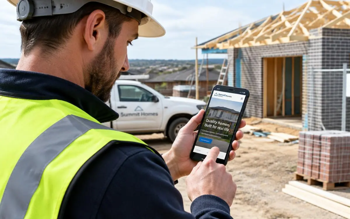
A building job is a big decision made slowly. People look at your finished work, try to judge whether you're organised, and then look for proof you're licensed and insured. Website design for builders is about making that whole assessment easy.
The layout, top to bottom
- Hero. One wide photo of your best finished build, what you build and where, and a quote button.
- What you build. Cards per build type, each with a real project photo.
- Projects. Six to nine builds, each with a few photos and a line about the brief.
- How it works. Four to six steps from first call to handover. This is the section that separates organised builders from the rest.
- Credentials. Builder licence number, insurance, warranty, years building, association memberships.
- Reviews. With suburbs and the type of build.
- Areas covered. The councils and suburbs you build in.
- Contact. Short form plus phone.
Pages worth having
- New home builds
- Home extensions and second storeys
- Renovations
- Knockdown rebuilds
- Granny flats and secondary dwellings
- Decks, pergolas and outdoor living
- Commercial fit-outs, if you do them
- Insurance and repair work, if you do it
Design choices that matter for builders
- Wide, consistent project photos. Same crop, same feel. Mixed orientations make a portfolio look thrown together.
- Project pages, not one giant gallery. A page per build gives Google something to rank and gives buyers a story to read.
- Restrained, architectural design. Plenty of white space, one accent colour, large type. Let the buildings be the visual interest.
- Compressed images. Building sites are photo-heavy and get slow fast.
- An enquiry form that asks about the project. Build type, suburb, rough timeframe. It filters out tyre-kickers without being off-putting.
Related reading: website photos that win work and should every service have its own page.
Builder website design checklist
- Wide finished-build photo in the hero
- What you build and where, in the first line
- A page per build type with its own photos
- A clear step-by-step process section
- Builder licence number, insurance and warranty visible
- Reviews that name the suburb and build type
- Consistent photo crops throughout
- Every image compressed for mobile
This is the layout I build under builder website design, with your content and project write-ups handled for you.
Need a Better Website for Your Business?
Professional websites built by Mike - $99 to get started, with the first 14 days free once your website goes live, then $45/week, including hosting, your domain, SEO foundations and a monthly update.
$99 to get started. First 14 days free once live, then $45/week.
Common questions
- Should a builder publish price guides?
- A per-square-metre range or a typical project band helps serious buyers self-qualify. You don't need exact figures - you need to show which market you're in.
- How many projects should the portfolio show?
- Six to nine strong builds beats twenty average ones. Depth on each project matters more than the count.

Written by Mike - Web Guy Mike
I build and look after websites for Australian tradies and small service businesses. Every site is built by me - no outsourcing, no account managers. More about Mike.